
This article is only a personal trading study note and does not constitute investment advice. Trading involves risk. Make independent judgments and take responsibility for your own decisions.
How to use momentum structure to support market judgment.
This is an experiment Penchan has been working on recently, organized into an article for everyone.
Price Balance and Imbalance
When price is balanced in an area, it means buyers and sellers can almost match each other there, so price tends to hover nearby. On the chart, that appears as consolidation. When price is imbalanced, it means the same price cannot match enough buyers or sellers, leading to a sharp drop or sharp rise. On the chart, that appears as a large candle.
Imbalance Caused by Thin Liquidity or Large Capital Entering
A large candle clearly tells us that price has entered an imbalanced state. This usually comes from one of two things: (1) Liquidity is thin, so a market order causes a large price change; (2) the capital entering the market is large enough that even many resting orders cannot absorb it.
Imbalance appears on the chart in many ways. In addition to large candles, it can appear as FVG, Fair Value Gap, consecutive same-direction candles, and so on. These can all serve as characteristics of imbalance.
Example 1: Using Imbalance to Support Trend Judgment
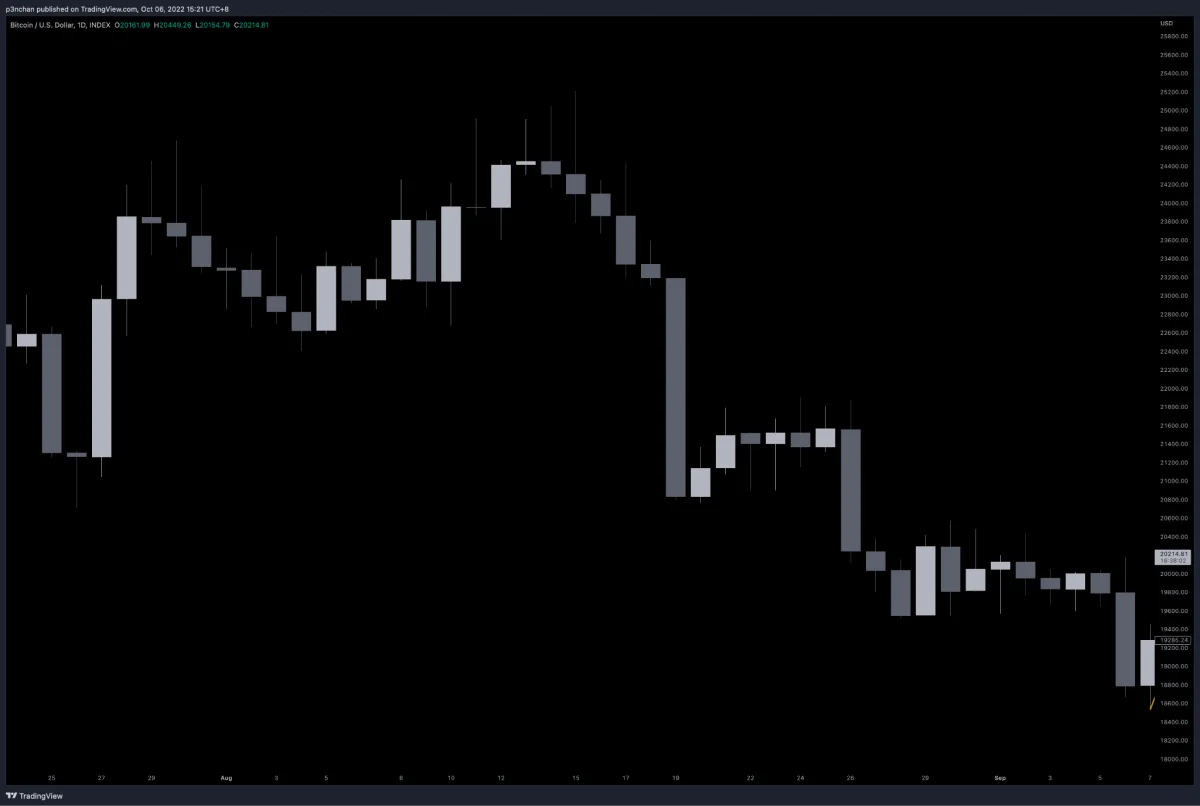
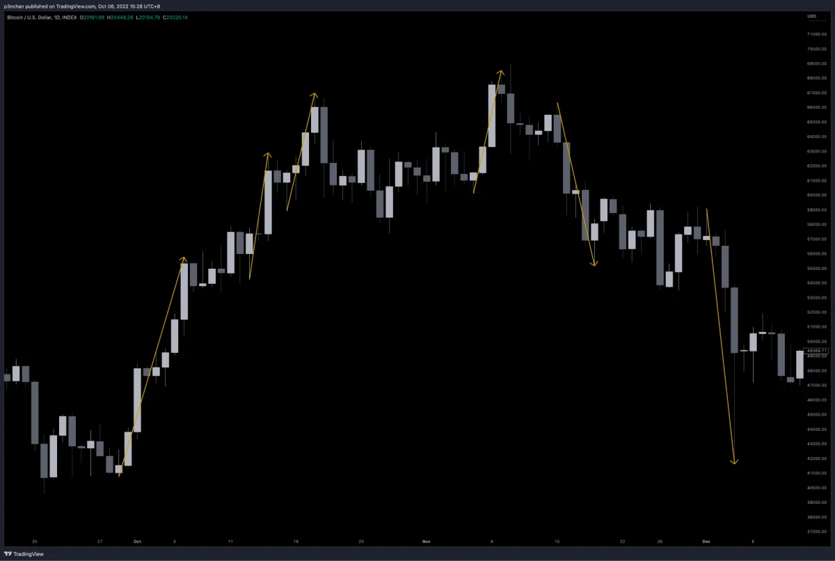
Several traces of price imbalance can be observed on the chart. I marked them with directional lines.
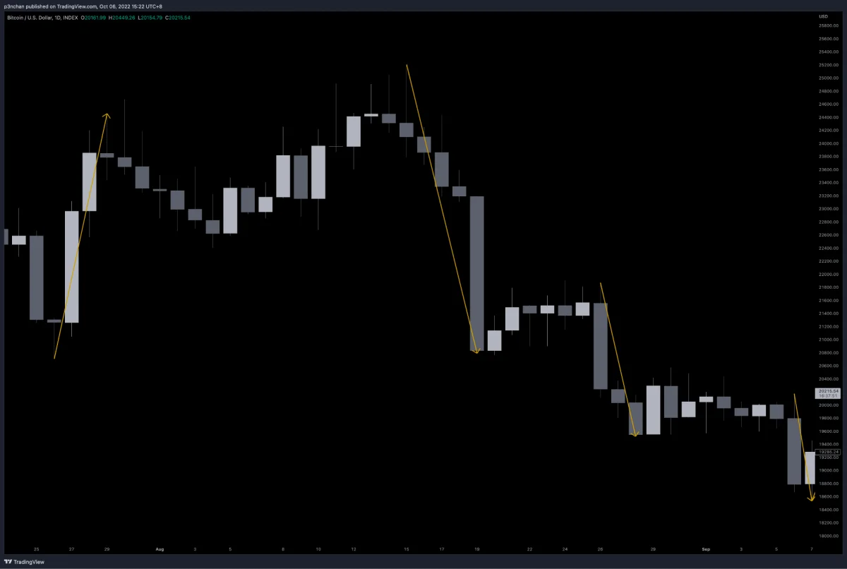
On the left side of the chart, price first rises, then hovers near the top and produces consecutive same-direction bearish candles, even engulfing the original upward Momentum. After that, two more imbalance events occur. At this point, we can notice that the imbalance is gradually weakening, and a reversal may have a chance to develop later.
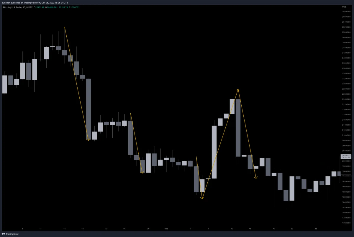
In this example, imbalance gradually weakens, then price reverses upward. After that, one more imbalanced drop occurs.
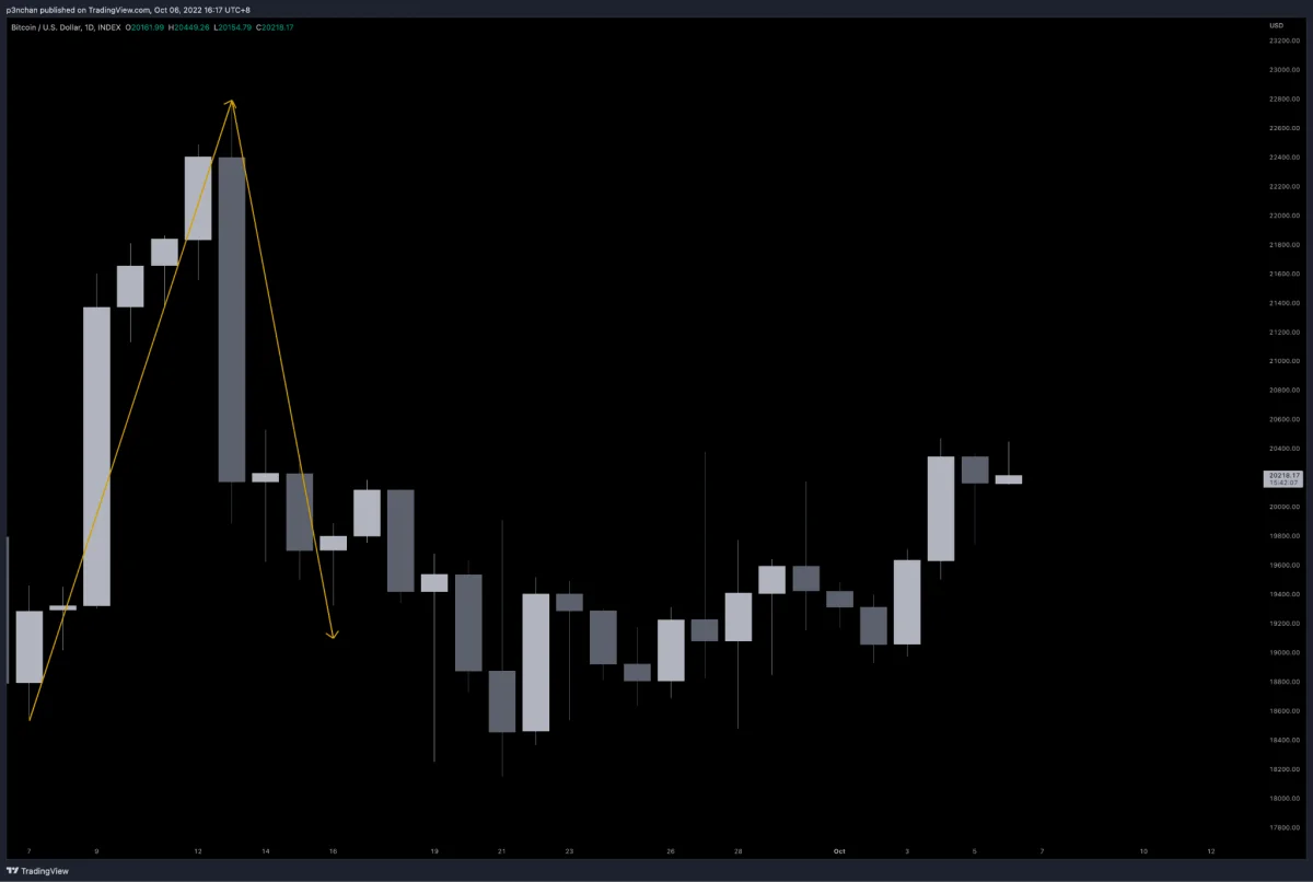
The current chart is in a balanced state, meaning a consolidation period, with no obvious large Momentum appearing.
Example 2: The Second Stage of the 2021 Bull Market
In the second stage of the previous bull market, we can see that upward Momentum on the left gradually slowed. Even the Momentum that produced the 69K ATH was roughly similar to the previous push, suggesting Momentum was starting to run short. The market then developed MSB and a potential trend reversal. After that, the reversal structure formed, followed by a new trend and the December 4 crash.
Example 3: Current Market Condition
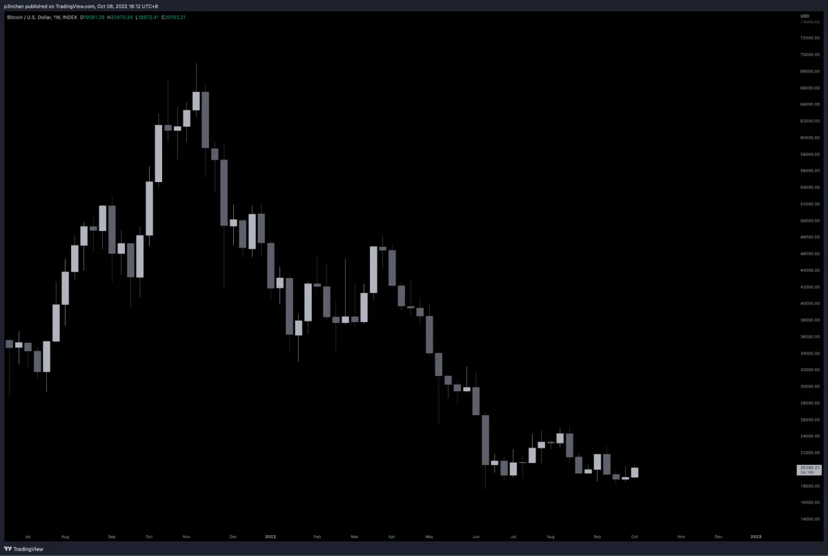
How does the current momentum structure look? That is for you to read.
Here are a few ideas. You can compare it with weekly rallies from past bull markets, or with the weekly structure after the previous bull market turned bearish. My drawing is only for reference: https://bit.ly/3CfyJ4T
Afterword
There is no single correct answer when drawing Momentum. You can test it through your own review experience and define rules for judgment. At the same time, momentum structure is mainly a supporting method for reading trend structure. I recommend using it together with market-structure trend judgment.